

Does a beautiful Instagram grid really make a difference?
The short answer is YES, it absolutely makes a difference. You probably already had an idea this was the answer because when you check out new accounts on Instagram the ones you find most appealing are the ‘prettiest’. If the grid is appealing you are more likely to scroll through and click on more posts. On the flip side, if a grid is chaotic and busy, your eye gets lost in the ‘mess’, probably tunes out after one or two scrolls, hits the back button and that account loses a possible new follower.
I’ve been asked this question a lot from clients and followers, ‘does it really matter if my grid looks curated?’ While this is the question I often hear, when I boil down to the heart of the matter the real question they are asking is, ‘Is it worth my time to figure out how to make my Instagram grid look nice?’ And my answer to that question is something really annoying, ‘it depends.’
There are a few big questions I like to ask when I get asked about a grid’s look and pattern.
Do you struggle to find content ideas for your social media channels?
Has a focus on achieving a certain look or grid pattern ever stopped you from publishing a post?
Are you able to consistently post at least 3 times a week without feeling overwhelmed to the point where you hate creating content?
If the answer to any of these is “Yes”, then I immediately recommend, “forget the ‘look’ and focus on consistency.” Publishing posts on a consistent basis is the number one priority for any small business owner on any social media platform. Without posts there is absolutely NOTHING your audience can do to engage with you and you will NOT grow.
Now, with all that said, there are some very simple ways to modify the ‘look’ of your grid to make it look professional and intentional, without causing you stress and anxiety. Here are my quick tips to achieving a professional and clean looking Instagram grid!
Narrow down your brand colours. Limit the colours you use in graphics and even images to three, five at the most (I recommend starting with less and work your way up slowly). Narrowing your colour palette will immediately give your feed a cohesive look. Bonus tip: stick with the same colour and experiment with a few different shades of the same colour. If you need brand design help, hit up my girl Alana @loveleighmaed, she is a design genius!
Limit your filter selection to two. When you post photos, choose two Instagram filters and stick with them. If you have an eye for colour, try choosing filters that dial up your brand colours and down anything bright that does not fall in line. For example, if you are going with a green and blue theme, choose filters that edit those colours up and pinks and reds down.
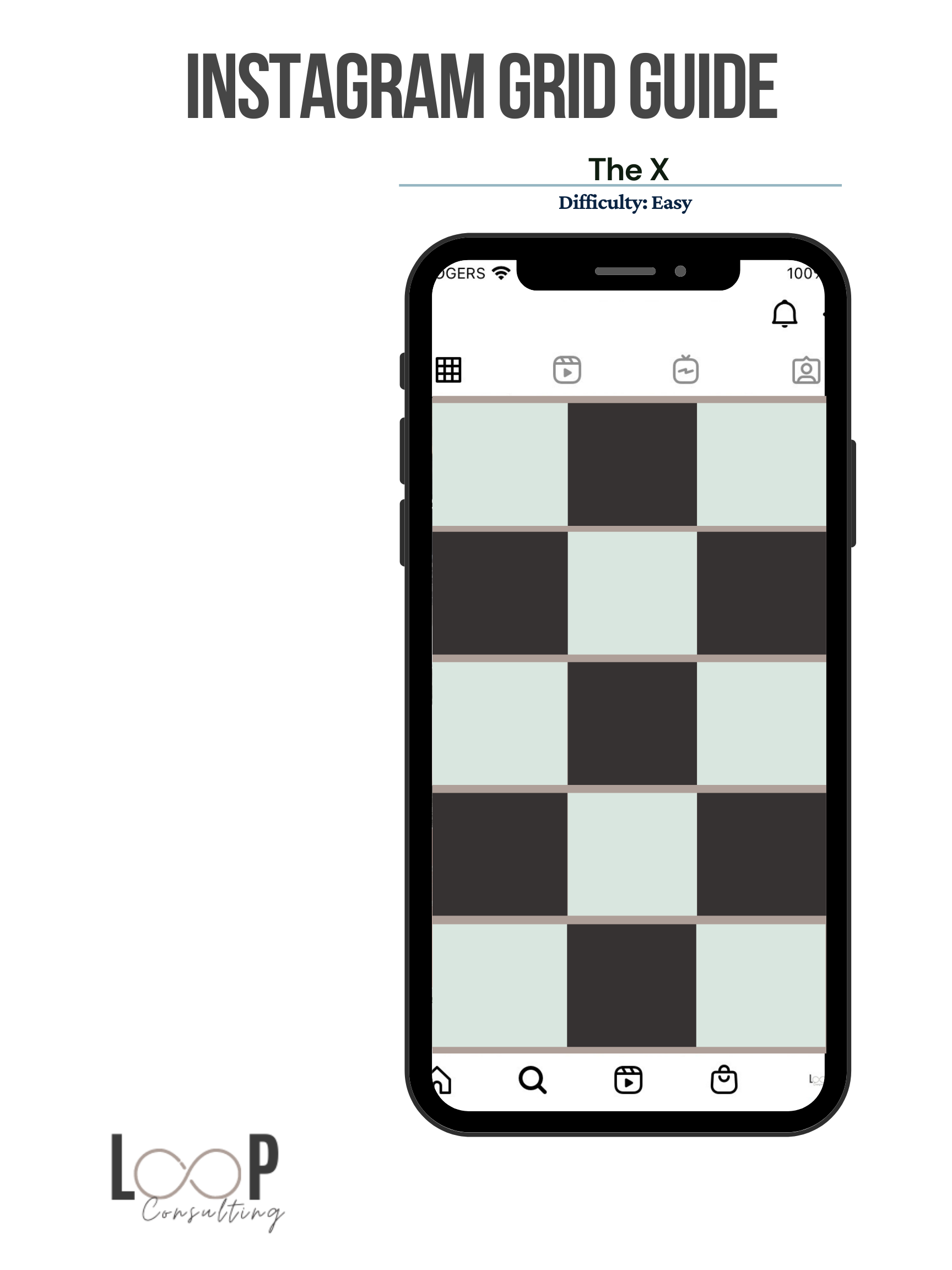
Go with an X grid pattern. This is the simplest and most versatile grid pattern out there. All you need to remember is alternate between 2 different elements. This could be colours, text and photos, post types (ex: Carousels and Reels), pretty much anything you can think of. By alternating post types you will create an X pattern throughout your grid that is pleasing to the eye and naturally highlights certain types of posts. Check out this graphic so you can see what I’m talking about.
That’s it! If you do these three easy steps you will have a professional looking Instagram grid within 9 posts!
If you are interested in learning about how to work with slightly more complex grid patterns, check out my Freebie Library where I’ve uploaded 6 different grid guides for you to try starting on your next post.